matplotlib exercises#
import matplotlib.pyplot as plt
import numpy as np
Q1: planetary positions#
The distances of the planets from the Sun (technically, their semi-major axes) are:
a = np.array([0.39, 0.72, 1.00, 1.52, 5.20, 9.54, 19.22, 30.06, 39.48])
These are in units where the Earth-Sun distance is 1 (astronomical units).
The corresponding periods of their orbits (how long they take to go once around the Sun) are, in years
P = np.array([0.24, 0.62, 1.00, 1.88, 11.86, 29.46, 84.01, 164.8, 248.09])
Finally, the names of the planets corresponding to these are:
names = ["Mercury", "Venus", "Earth", "Mars", "Jupiter", "Saturn",
         "Uranus", "Neptune", "Pluto"]
(technically, pluto isn’t a planet anymore, but we still love it :)
Plot as points, the periods vs. distances for each planet on a log-log plot.
Write the name of the planet next to the point for that planet on the plot
Q2: drawing a circle#
For an angle \(\theta\) in the range \(\theta \in [0, 2\pi]\), the polar equations of a circle of radius \(R\) are:
We want to draw a circle.
Create an array to hold the theta values—the more we use, the smoother the circle will be
Create
xandyarrays fromthetafor your choice of \(R\)Plot
yvs.x
Now, look up the matplotlib fill() function, and draw a circle filled in with a solid color.
Q3: Circles, circles, circles…#
Generalize your circle drawing commands to produce a function,
draw_circle(x0, y0, R, color)
that draws the circle. Here, (x0, y0) is the center of the circle, R is the radius, and color is the color of the circle.
Now randomly draw 10 circles at different locations, with random radii, and random colors on the same plot.
Q4: Climate#
Download the data file of global surface air temperature averages from here: https://raw.githubusercontent.com/sbu-python-summer/python-tutorial/master/day-4/nasa-giss.txt
(this data comes from: https://data.giss.nasa.gov/gistemp/graphs/)
There are 3 columns here: the year, the temperature change, and a smoothed representation of the temperature change.
Read in this data using
np.loadtxt().Plot as a line the smoothed representation of the temperature changes.
Plot as points the temperature change (no smoothing). Color the points blue if they are < 0 and color them red if they are >= 0
You might find the NumPy where() function useful.
Q5: subplots#
matplotlib has a number of ways to create multiple axes in a figure – look at plt.subplots() (http://matplotlib.org/api/pyplot_api.html#matplotlib.pyplot.subplot)
Create an x array using NumPy with a number of points, spanning from \([0, 2\pi]\).
Create 3 axes vertically, and do the following:
Define a new numpy array
finitialized to a function of your choice.Plot f in the top axes
Compute a numerical derivative of
f, $\( f' = \frac{f_{i+1} - f_i}{\Delta x}\)$ and plot this in the middle axesDo this again, this time on \(f'\) to compute the second derivative and plot that in the bottom axes
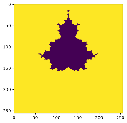
Q6: Mandelbrot set#
The Mandelbrot set is defined such that \(z_{k+1} = z_k^2 + c\) remains bounded, which is usually taken as \(|z_{k+1}| \le 2\) where \(c\) is a complex number and we start with \(z_0 = 0\)
We want to consider a range of \(c\), as complex numbers \(c = x + iy\), where \(-2 < x < 2\) and \(-2 < y < 2\).
For each \(c\), identify its position on a Cartesian grid as \((x,y)\) and assign a value \(N\) that is the number of iterations, \(k\), required for \(|z_{k+1}|\) to become greater than \(2\).
The plot of this function is called the Mandelbrot set.
Here’s a simple implementation that just does a fixed number of iterations and then colors points in Z depending on whether they satisfy \(|z| \le 2\).
Your task is to extend this to record the number of iterations it takes for each point in the Z-plane to violate that constraint, and then plot that data – it will show more structure
N = 256
x = np.linspace(-2, 2, N)
y = np.linspace(-2, 2, N)

xv, yv = np.meshgrid(x, y, indexing="ij")
c = xv + 1j*y

z = np.zeros((N, N), dtype=np.complex128)

for i in range(10):
    z = z**2 + c

m = np.ones((N, N))
m[np.abs(z) <= 2] = 0.0
fig, ax = plt.subplots()
ax.imshow(m)
<matplotlib.image.AxesImage at 0x7fa5b2bdf230>